import plotly.graph_objects as go

# Sample data
x = [1, 2, 3, 4, 5]
y = [10, 12, 8, 15, 11]

# Create a figure
fig = go.Figure()

# Add a line trace
fig.add_trace(go.Scatter(x=x, y=y, mode='lines', name='line'))

# Update layout
fig.update_layout(title='Basic Line Chart', xaxis_title='x-axis', yaxis_title='y-axis')

# Show the plot
fig.show()04-17-24 (Wednesday)
Let us confess to God those things that are wrong in our work:
That the presence of God at work is often overlooked;
That creative people are often subjected to long, boring and unrelenting routines;
That skills are undeveloped through lack of training;
That resources are wasted in shoddy work and the production of unwanted goods;
That the maximisation of profit often excludes concern for people;
That men and women are discriminated against because of age, race, gender, disability, lack of skill and length of employment;
That the poor stand so little chance against the power of the rich, and the world’s destitute are forgotten.
Lord, have mercy upon us. Forgive us our sins and help us to amend our lives. Amen.
(https://www.theologyofwork.org/work-in-worship)
1 Visualizing data
1.1 Matplotlib
Let’s check the matplotlib quick start guide!
1.2 Other libraries
1.2.1 Seaborn:
- Seaborn is a statistical data visualization library built on top of Matplotlib, and simplifies the creation of complex visualizations like heatmaps, violin plots, and pair plots.
- Provides themes and color palettes that improve the aesthetics of plots.
- Best suited for statistical data exploration and analysis.
1.2.2 Plotly
- A library for creating web-based interactive plots and dashboards. It is very useful for web applications, presentations and notebooks.
- Whereas matplotlib’s output is mostly a static image, see, for example, the output of plotly:
1.3 Example: basketball player statistics
One common application of NumPy in sports analytics is in analyzing player performance statistics. Let’s consider an example where we have a dataset of basketball players and their performance in terms of points scored, rebounds, and assists. We’ll use NumPy to calculate some basic statistics and visualize the data.
import numpy as np
import matplotlib.pyplot as plt

# Sample data: player performance (points, rebounds, assists)
player_data = np.array([
    [20, 5, 3],
    [15, 7, 2],
    [25, 3, 5],
    [18, 6, 4],
    [22, 4, 6]
])

# Calculate the mean, median, and standard deviation for each stat
mean_stats = np.mean(player_data, axis=0)
median_stats = np.median(player_data, axis=0)
std_stats = np.std(player_data, axis=0)

print("Mean:", mean_stats)
print("Median:", median_stats)
print("Standard Deviation:", std_stats)

# Plot the data
plt.figure(figsize=(10, 6))
plt.bar(np.arange(3)-0.2, mean_stats, width=0.2, label='Mean', align='center')
plt.bar(np.arange(3), median_stats, width=0.2, label='Median', align='center')
plt.bar(np.arange(3)+0.2, std_stats, width=0.2, label='Standard Deviation', align='center')
plt.xticks(np.arange(3), ['Points', 'Rebounds', 'Assists'])
plt.ylabel('Value')
plt.title('Player Performance Statistics')
plt.legend()
plt.show()
Mean: [20. 5. 4.]
Median: [20. 5. 4.]
Standard Deviation: [3.40587727 1.41421356 1.41421356]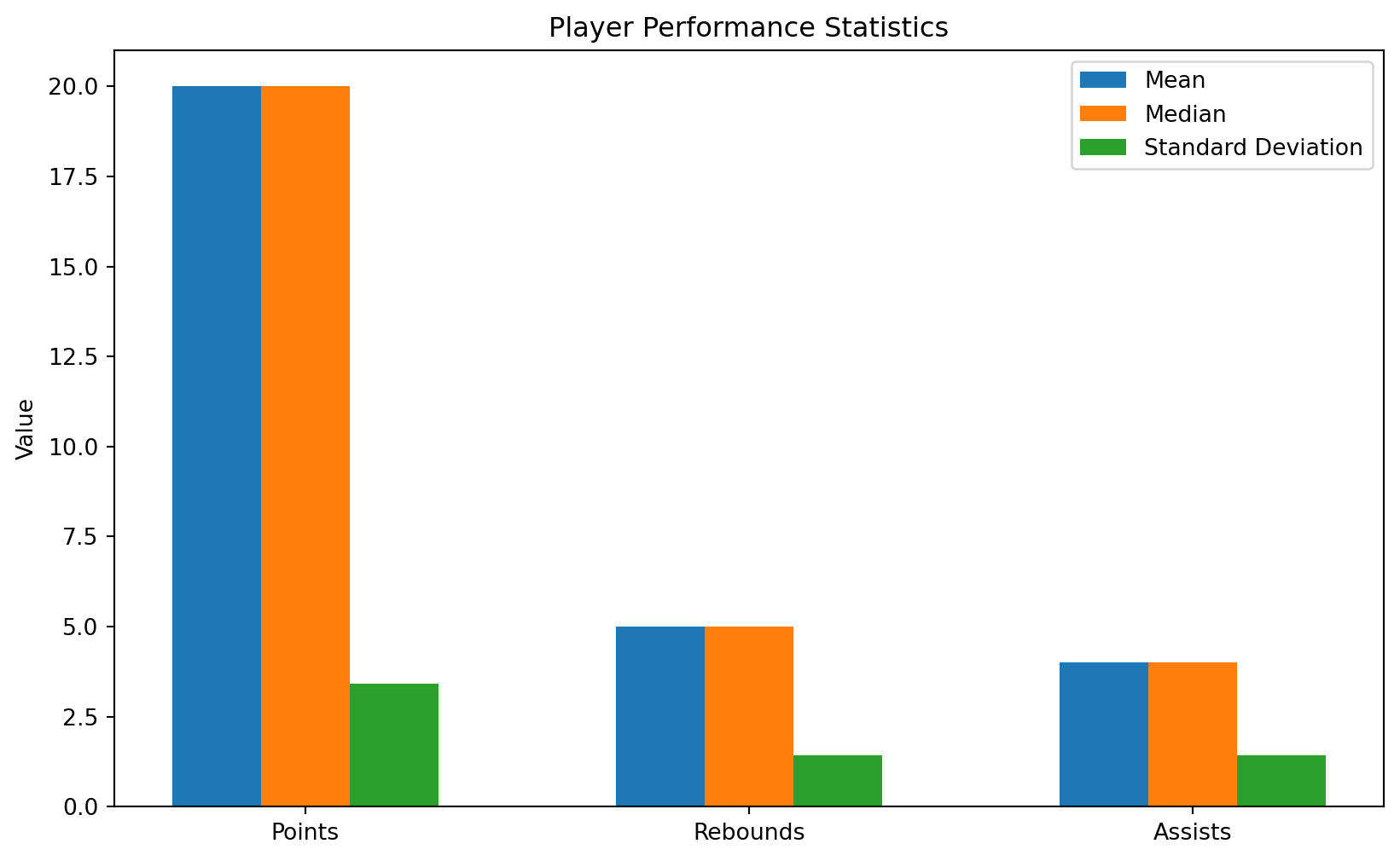
In this example, we first create a NumPy array player_data representing the performance of five basketball players in terms of points, rebounds, and assists. We then use NumPy to calculate the mean, median, and standard deviation for each statistic across all players.
Finally, we use Matplotlib to plot a bar chart showing these statistics for each category (points, rebounds, assists). The bar chart compares the mean, median, and standard deviation for each category, providing a visual comparison of player performance statistics.
1.4 Example: calculating angles for a robot arm
In robotics, a common application of linear systems is in robot kinematics, specifically in calculating the inverse kinematics of a robot manipulator. Inverse kinematics involves determining the joint angles required to position the end-effector (e.g., robot gripper) at a desired position and orientation.
Let’s consider a simple 2D robotic arm with two joints. Given the lengths of the two links and the coordinates of the end-effector in the robot’s workspace, we can calculate the joint angles required to reach that position.
Assume the following parameters for the robot: - Length of the first link: \(L_1 = 1\) - Length of the second link: \(L_2 = 1\)
Let \((x, y)\) be the coordinates of the end-effector in the robot’s workspace. The forward kinematics equations for the end-effector position are given by:
\[ x = L_1 \cos(\theta_1) + L_2 \cos(\theta_1 + \theta_2) \]
\[ y = L_1 \sin(\theta_1) + L_2 \sin(\theta_1 + \theta_2) \]
Given \(x\) and \(y\), we can solve these equations to find \(\theta_1\) and \(\theta_2\) using NumPy.
import numpy as np

# Robot parameters
L1 = 1
L2 = 1

# End-effector position
x = 1
y = 1

# Calculate inverse kinematics
r = np.sqrt(x**2 + y**2)
theta2 = np.arccos((L1**2 + L2**2 - r**2) / (2 * L1 * L2))
theta1 = np.arctan2(y, x) - np.arctan2(L2 * np.sin(theta2), L1 + L2 * np.cos(theta2))

# Convert angles to degrees for easier interpretation
theta1_deg = np.degrees(theta1)
theta2_deg = np.degrees(theta2)

# Print the joint angles
print("Joint angles (theta1, theta2) in degrees:")
print(theta1_deg, theta2_deg)
Joint angles (theta1, theta2) in degrees:
-6.3611093629270335e-15 90.00000000000001We can create an interactive visualization of this problem:
import numpy as np
import matplotlib.pyplot as plt
from matplotlib.widgets import Slider

# Robot parameters
L1 = 1
L2 = 1

# Initial x and y positions
x_init = 1
y_init = 1

# Calculate initial theta angles
theta1_init = np.degrees(np.arctan2(y_init, x_init))
D = (x_init**2 + y_init**2 - L1**2 - L2**2) / (2 * L1 * L2)
theta2_init = np.degrees(np.arccos(D))

# Create figure and axis
fig, ax = plt.subplots()
ax.set_aspect('equal')
ax.set_xlim(-2, 2)
ax.set_ylim(-2, 2)
ax.grid(True)

# Initialize plot elements
link1, = ax.plot([], [], 'o-', color='blue', lw=2, markersize=8)
link2, = ax.plot([], [], 'o-', color='red', lw=2, markersize=8)
ee, = ax.plot([], [], 'o', color='green', markersize=8)

# Update function
def update(val):
    x = slider_x.val
    y = slider_y.val

    theta1 = np.degrees(np.arctan2(y, x))
    D = (x**2 + y**2 - L1**2 - L2**2) / (2 * L1 * L2)
    theta2 = np.degrees(np.arccos(D))

    # Calculate end-effector position
    x_end = L1 * np.cos(np.radians(theta1)) + L2 * np.cos(np.radians(theta1) + np.radians(theta2))
    y_end = L1 * np.sin(np.radians(theta1)) + L2 * np.sin(np.radians(theta1) + np.radians(theta2))

    # Update plot elements
    link1.set_data([0, L1 * np.cos(np.radians(theta1))], [0, L1 * np.sin(np.radians(theta1))])
    link2.set_data([L1 * np.cos(np.radians(theta1)), x_end], [L1 * np.sin(np.radians(theta1)), y_end])
    ee.set_data(x_end, y_end)

    fig.canvas.draw_idle()

# Create sliders
ax_slider_x = plt.axes([0.1, 0.1, 0.65, 0.03])
ax_slider_y = plt.axes([0.1, 0.05, 0.65, 0.03])
slider_x = Slider(ax_slider_x, 'X', -2, 2, valinit=x_init)
slider_y = Slider(ax_slider_y, 'Y', -2, 2, valinit=y_init)

slider_x.on_changed(update)
slider_y.on_changed(update)

plt.show()
2 Doing reproducible science with Jupyter
- Jupyter is an open-source project that allows you to create and share documents that contain live code, equations, visualizations, and narrative text.
- The name “Jupyter” is a combination of Julia, Python, and R, the three programming languages initially supported by Jupyter.
- It is also a way to cooperate with other scientists with a shared document.
- Jupyter follows a philosophy of open and reproducible science. In a time when lots of manipulations and calculations are done with data, it is good to be transparent about what is being done and let the person him/herself redo your process step by step.
- In a certain sense, it is also a logbook to be kept by a scientist, remembering that this was always a common practice in science.
2.1 Exercise: creating your own Jupyter notebook
- You can follow any tutorial and try to create your own scientific notebook in Jupyter.
- A shortcut would be using JupyterLab on your own browser.
- Generate some random data and try to create a visualization of that using matplotlib or plotly.
- For example, you can use toy datasets in sklearn.datasets,
- Use any kind of plot you find interesting
- Customize the plot:
- Change the color and style of the plot elements (lines, markers, etc.).
- Add labels to the x-axis and y-axis.
- Add a title to the plot.
- Customize the ticks and grid lines.
- Add annotations or text to the plot.
- Adjust the size and aspect ratio of the plot.
- Lists of interesting Jupyter notebooks and demonstrations can be found here and here.
2.2 Some reflection…
- What are the virtues of reproducibility and transparency?
- Does reproducibility play a role in determining the truth or validity of a scientific finding?
- Is there an obligation for scientists to ensure that their research is reproducible?
- What are the implications of publishing non-reproducible results?
- Should funding agencies, journals, and scientific institutions implement policies to promote reproducibility, such as requiring data and code sharing?
Some recent reflection on trust and reproducibility in science and their relation to christianity: Josh A. Reeves, Redeeming Expertise.